
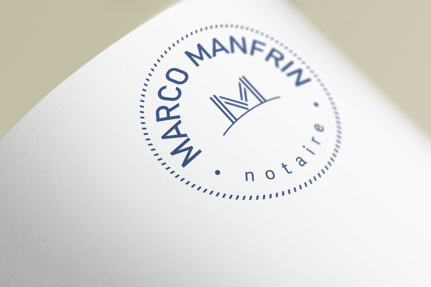
Marco Manfrin . Notaire
Role
Branding · Graphic Design
Location
Montreal · Quebec · Canada
Context
Marco Manfrin is a notary based in Montreal, providing services related to legal documentation, contracts, and real estate transactions.
Challenge
To create a visual identity aligned with the values of tradition, formality, and trust associated with the legal field.
Solution
The brand concept is built around the professional’s initials, with two interwoven “M” letters forming a symbol that conveys tradition, stability, and institutional strength.
The shapes reference fountain pens and architectural foundations, reinforcing ideas of legal formality, contract signing, and real estate security. The interlacing elements also symbolize trust, connection, and cohesion.
Deliverables
- Branding
- Visual Identity
- Logo
- Brand Guidelines
- Corporate Stationery


Logo Variations
Marco Manfrin’s logo can change according wit the context.


Contact Me
Copyright © Érico Almeida